Error Analysis in Experimental Physical Science

§14 - Graphical Analysis

So far we have been using arithmetic and statistical procedures for most of our analysis of errors. In this section we discuss a way to use graphs for this analysis.

First, we introduce the use of "error bars" for the graphical display of a data point including its errors. We illustrate for a datapoint where (x, y) = (0.6 ± 0.1, 0.5 ± 0.2).

The value of the datapoint, (0.6, 0.5), is shown by the dot, and the lines show the values of the errors. The lines are called error bars.


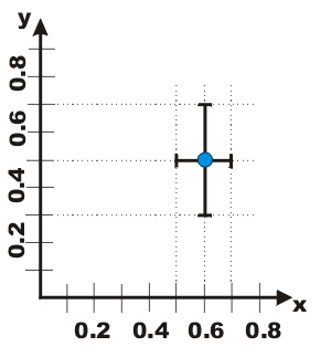
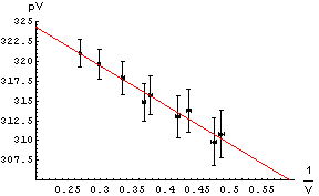
To the right we show data used in the analysis of a Boyle's Law experiment in the introductory Physics laboratory at the University of Toronto. Note the error bars on the graph. Instead of using a computer to fit the data, we may simply take a straight edge and a sharp pencil and simply draw the line that best goes through data points, as shown. Note we have used a red pencil.

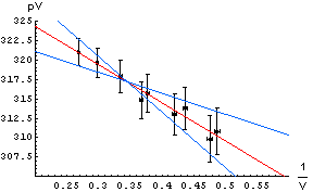
Recall that the slope is defined as the change in the dependent variable, pV in this case, divided by the change in the independent variable, 1/V in this case. The intercept is defined as the value of the dependent variable when the independent variable is equal to zero. In the graph to the right, the point where the independent variable is equal to zero is not shown.

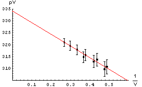
From the drawn line we can calculate that the intercept is 334 and the slope is -49.

Fitting data graphically

The errors in the determination of the intercept and slope can be found by seeing how much we can "wiggle" the straight edge and still go through most of the error bars. To the right we draw those lines with a blue pencil.

The intercepts and slopes of the blue lines, then, allows us to estimate the error in the intercept and slope of the red best match to the data.

For this example, this procedure gives an estimate of the error in the intercept equal to ± 4 and the error in the slope equal to ± 10.

So finally:

.
Estimating the errors

intercept = 334 ± 4
slope = -49 ± 10


Question 14.1. Above we said the blue lines need only go through "most of the error bars." Assuming that the error bars represent standard errors such as the standard deviation, what is the numerical definition of "most"?

Question 14.2. In the first graph above we can not read the intercept directly off the graph because of the scale we have chosen. In the example to the right we can: it is just the point where the line intercepts the pV axis. Why is this graph not as good as the first one?

Another scaling of the graph

Previous section Next section

This document is Copyright © 2001. 2004 David M. Harrison

Creative Commons License This work is licensed under a Creative Commons License.

This is $Revision: 1.5 $, $Date: 2004/07/18 16:42:00 $ (year/month/day) UTC.